The Matching-Pots Myth: When Variety Helps a Plant Display
A varied plant display can feel composed without matching pots. Use a restrained palette of shapes, colors, or materials to connect distinct containers.
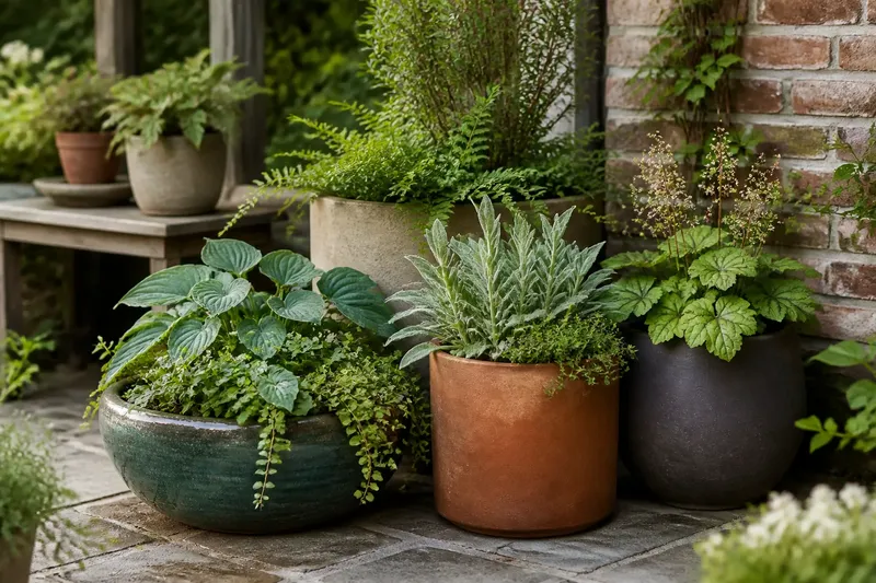
A plant display can feel more deliberate when its pots do not match. The trick is to give the containers a shared visual thread—such as a repeated color, a family of shapes, or a consistent material—then let other details vary. That approach keeps the eye moving from plant to plant without making the arrangement feel like a row of identical objects.
Matching is only one way to make a display cohere
Matching pots create instant order. Line up a set of identical planters and the containers recede into a single, steady pattern. That can suit a formal entrance or a narrow ledge where repetition is part of the design. But uniformity is not the same as coherence. A display can feel connected even when its containers differ, provided the differences have a clear relationship.
Think of a group of pots as a small collection rather than a set. A collection can include a broad bowl, a tall cylinder, and a rounded pot, while a recurring finish or material ties them together. The plants supply another layer of connection: foliage color, leaf size, or a shared sense of fullness can link containers that look unlike one another.
The useful question is not “Do these pots match?” but “What makes these pots belong together?” Answer that before adding more containers. It gives variety a purpose.
Choose one visual thread to carry through the group
Start with a feature that can repeat without making every pot identical. The simplest options are color, shape, and material. Choose one as the dominant link, then treat the others as places where you can vary the composition.
- Color: Keep pots within a restrained family, such as warm clay, muted cream, and soft rust. Shapes and materials can differ while the related tones hold the group together.
- Shape: Repeat a rounded outline or a straight-sided profile. The pots can use different finishes and colors, but their silhouettes will echo one another.
- Material: Bring together containers with a shared surface character, such as matte ceramic or weathered metal. Their shapes can vary as long as the material remains visually legible.
Let one of these links lead. If you repeat every feature, you are back to a matching set. If nothing repeats, the display may read as a collection of unrelated purchases. A clear primary thread leaves room for smaller differences to add character.
For example, imagine a shaded patio with a blue-green glazed bowl, a plain terracotta cylinder, and a dark, rounded planter. If the plants share broad, soft foliage and the containers cluster around a similar muted color family, the varied outlines can feel intentional. The expected visual result is a group with enough contrast to notice, but enough connection to read as one display.
Use silhouette to give each pot a clear role
Shape affects a display before anyone notices a glaze or surface texture. A tall pot draws the eye upward; a low bowl spreads attention across its rim; a rounded vessel softens a hard corner. Those differences can help assign each container a role instead of leaving every pot to compete for the same attention.
Begin with the plants. A trailing plant may look at ease in a broad container that lets its stems spill over the rim. A plant with upright leaves can pair naturally with a taller, more vertical form. These are visual relationships, not rigid rules: the useful choice is the one that lets the plant’s shape and the container’s outline remain visible together.
Then look at the group from the place people will usually see it. If every pot has the same height, the display can flatten into a line. If every pot is dramatically different, each one may demand its own spotlight. A mix of low, middle, and taller silhouettes usually creates a more readable rhythm. Keep the tallest form from blocking a smaller plant that deserves attention.
Pay attention to negative space as well—the open gaps between containers and leaves. A little air around a sculptural pot can make its outline easier to read. Tight spacing can work for a lush, abundant look, but then repeated color or material becomes especially helpful in keeping the group connected.
Let color and surface connect unlike containers
Color does not have to mean a row of identical bright pots. It can be a quiet relationship among earth tones, smoky neutrals, or a few softened colors that share a similar intensity. When one container is vivid, nearby pots can use calmer finishes so the display does not become a contest between surfaces.
Consider how the pots meet their setting. Against brick, warm clay and deep green can feel grounded; beside pale stone, a dark matte finish may give the plants a clearer outline. A container’s color also sits next to its foliage, not in isolation. Silver leaves can make a warm terracotta rim look more pronounced, while deep green foliage may blend into a dark pot and reduce the contrast between plant and vessel.
Surface texture can do work that color cannot. A rough, porous pot and a smooth glazed one may differ sharply in finish yet share a related hue. Conversely, several pots in similar colors can still look busy if each carries a strong pattern or glossy surface. Decide which feature should catch the light, and let the rest be quieter.
When color is the main thread, keep the palette small enough to recognize at a glance. A repeated tone can appear on one pot, a neighboring rim, and a nearby object already in the garden. It need not cover every container to make the relationship visible.
How can mixed pots still look intentional?
How many different pot styles work in one display?
There is no fixed number that suits every space. What matters is whether you can name the visual link among the containers; if you cannot, remove or reposition a pot until the relationship becomes clearer.
Can different colors work together?
Yes, especially when the colors share a quality such as warmth, softness, or depth. A bright accent can stand out, but it needs a quieter setting so it reads as a deliberate focal point rather than another competing note.
Should the plants match the pots?
The plants do not need to mirror the containers, but their forms should make sense beside them. Pairing a delicate, trailing plant with a heavy-looking vessel can create useful contrast, while similar shapes can make a calmer, more unified composition.
What if the pots are already a mismatched collection?
Group them by a feature they already share, such as warm undertones, rounded outlines, or a matte finish. If no common thread is apparent, use plant foliage and spacing to make a smaller, more focused group rather than forcing every container into one display.
Arrange the pots so variety has a rhythm
Set the containers in place before deciding that a group is finished. Look at them from the doorway, path, or seating area where the display will be seen. A pleasing arrangement often shifts between forms rather than stacking all the tall pots together or lining up every bowl like a serving dish.
Use repetition as a gentle guide. A pair of related pots can anchor one end of the display, while a different silhouette near the center keeps the eye moving. Repeated colors can appear at intervals rather than in a solid block. These small echoes create a rhythm without demanding exact symmetry.
Consider the background too. Against a plain wall, varied outlines can carry more of the visual interest. In a busy planting bed, a quieter palette may prevent the display from becoming one more competing pattern. The same group of pots can feel entirely different against a hedge, fence, or open paving, so judge it in its actual setting.
Move one container at a time and watch what changes. If the group suddenly feels crowded, restore breathing room. If one pot seems stranded, bring it closer to a container with a shared color or surface. Adjusting the arrangement is often more effective than buying another pot to fill a perceived gap.
Keep the design flexible as plants change
A container display is not a static composition. Plants grow, lose leaves, get replaced, or shift with the seasons. Pots that establish a visual thread make those changes easier to absorb: a new plant can join a familiar color family or silhouette without requiring a matching container.
Leave room for practical care as well as visual balance. Containers need access for watering, and plants need enough space for their growth and light conditions. When a change in plant size makes the group feel crowded, move a pot or separate the arrangement rather than squeezing everything closer together. For care and placement decisions that depend on a specific container or plant, follow its label or manufacturer instructions.
Before buying another pot, identify the role it should fill. Would a low bowl soften the arrangement? Is a shared finish missing? Does the display need a quieter container to give the vivid one room? A specific answer helps you choose a pot that strengthens the group instead of adding variety for its own sake.
The matching-pots myth fades once you see the display as a composition of relationships. Repeat one feature, vary the rest, and let each plant and container keep a distinct shape. For a varied plant display, that balance makes the arrangement feel connected while leaving it room to grow.